Design Leadership
Enterprise UX
Experimentation
From Cancellation Friction to $1.18M in Annual Savings
I led the redesign of Azure’s subscription cancellation experience, transforming one of Subscription Management’s lowest-rated journeys into a clearer, more trustworthy flow that improved customer success and delivered measurable business value.
Role
Lead Product Designer
Timeline
4 Weeks
Team
Research, Content, Product Management, and Engineering
I led the redesign of Azure’s subscription cancellation experience, transforming one of Subscription Management’s lowest-rated journeys into a clearer, more trustworthy flow that improved customer success and delivered measurable business value.
Overview
Azure’s subscription cancellation experience had one of the lowest Net Promoter Scores within Subscription Management. Customers struggled to understand what would happen to their resources, were frequently diverted away from the task, and often missed that an associated support plan required separate action.
These breakdowns created more than customer frustration. They also contributed to unexpected charges, recurring support incidents, and a loss of trust in the Azure experience.
As the lead designer for Subscription Management, I initiated and led a 4-week redesign focused on making cancellation simple, transparent, and predictable. I worked across research, data science, content, product, and engineering to connect customer pain points with business outcomes and deliver a solution that could be validated at scale.
The Challenge
Customers were not simply unhappy because they were leaving Azure. The cancellation experience itself created avoidable confusion.
The original flow presented dense warnings without enough hierarchy or context. Customers with active resources had to select a review action that removed them from the cancellation journey entirely. Those who continued were then shown another information-heavy screen where the relationship between their subscription and support plan was easy to miss.
As a result, customers could believe they had canceled everything while continuing to receive support-plan charges.
The business saw the consequences through low satisfaction scores and daily support contacts from customers who:
Could not complete cancellation
Continued to be charged for canceled services
Did not realize their support plan remained active

Challenging the Initial Assumption
Stakeholders initially believed the low NPS was primarily caused by the emotional nature of leaving Azure. The assumption was that customers would remain dissatisfied regardless of how well the cancellation experience was designed.
Rather than accepting that explanation, I conducted a UX audit and paired customer verbatims with telemetry and behavioral data.
The evidence pointed to a different conclusion: much of the dissatisfaction was being created by the experience itself.
Customers were not only reacting to cancellation. They were reacting to unclear consequences, interrupted journeys, hidden dependencies, and continued charges.
What the Data Revealed
Design Principles
The research pointed to three principles that guided every design decision.

Simplicity
Keep the path direct, remove unnecessary decisions, and help customers complete their intended task with minimal steps.

Clarity
Make consequences, dependencies, and next steps understandable before customers commit to cancellation..

Trust
Prevent unexpected charges and give customers confidence that Azure will carry out the action exactly as described.
Finding the Right Solution
I facilitated weekly reviews with UX Research, Data Science, Content Design, Product Management, and Engineering. Rather than moving directly from research to polished screens, I used each iteration to balance three competing needs:
Customer clarity
Functional completeness
Engineering feasibility
I explored multiple concepts to find the right balance of clarity, completeness, and feasibility. Each iteration surfaced important insights that shaped my final solution.
The Final Experience
1. Keep Customers on a Direct Path
The original journey allowed customers to leave the cancellation flow while reviewing resources. I removed the warning screen responsible for that diversion and restructured the experience as a clear, uninterrupted sequence.
Customers could still review resources, but doing so no longer replaced or disrupted their primary task.
The revised journey ensured that customers who intended to cancel reached the correct experience.
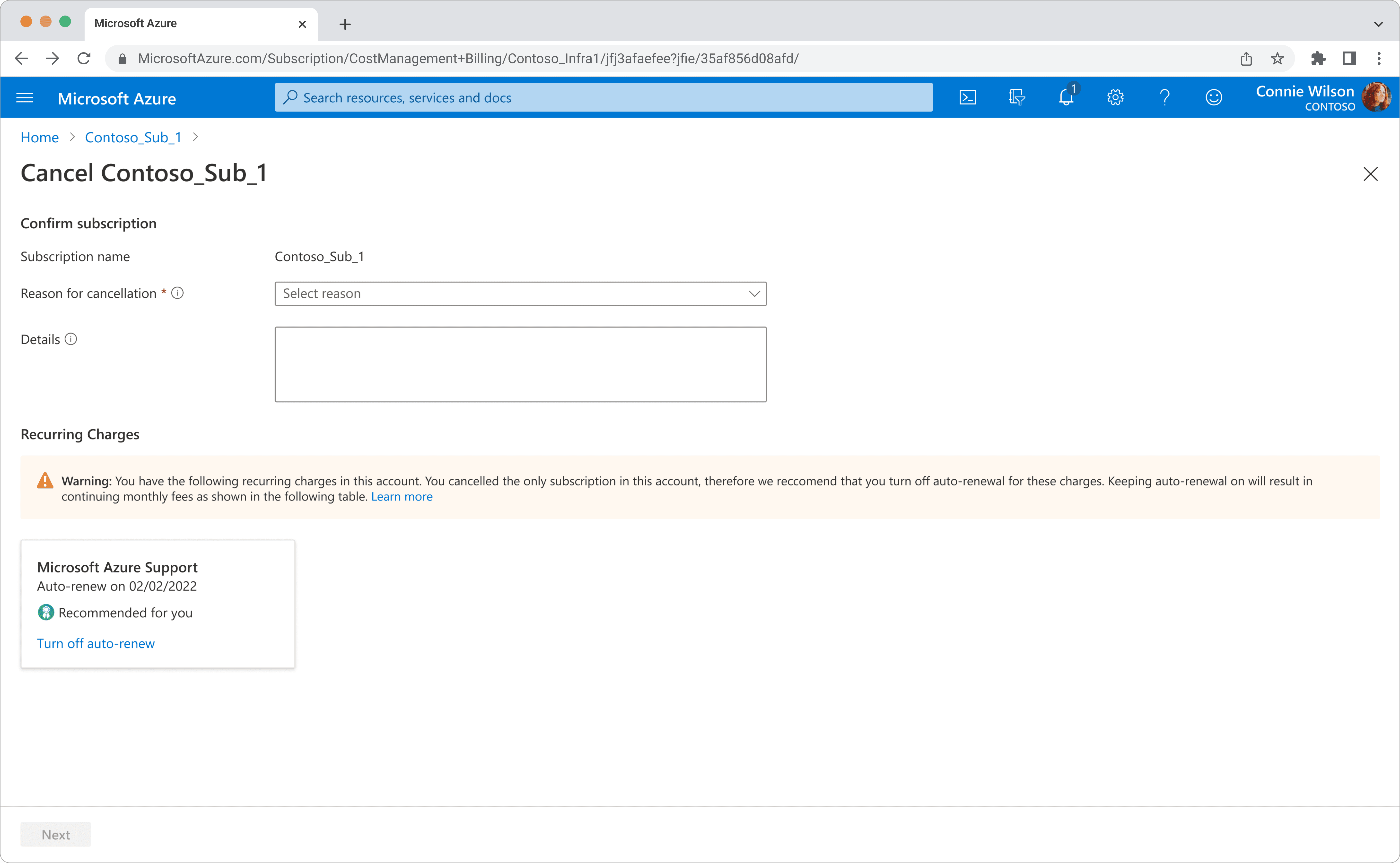
2. Surface Hidden Dependencies
The support plan had been treated as secondary information, even though missing it could lead directly to unexpected charges.
I moved support-plan management into the cancellation journey, clearly explained its relationship to the subscription, and allowed customers to turn off auto-renew before completing the task.
Resource review remained available, but it became optional and contextual rather than disruptive.

3. Create a Predictable Ending
The final confirmation experience was simplified and reorganized around the questions customers were most likely to have:
Was my subscription canceled?
When will access end?
Will I receive another invoice?
Is there anything else I need to do?
Essential billing information remained visible, but secondary details no longer competed with the confirmation message.

A clear confirmation state replaces uncertainty with a concise record of what happened and what customers should expect next.
Leading Through Constraints
This project required more than producing a polished interface. I had to create alignment around a problem that stakeholders initially believed could not be solved through design.
I used customer feedback and telemetry to reframe the opportunity, facilitated recurring cross-functional reviews, and connected design decisions to customer satisfaction, support demand, and operating cost.
When engineering raised concerns about the scope of the proposed resource grid, I did not treat the constraint as a reason to remove the capability. I redesigned the interaction so customers could receive the same core benefit through a simpler and less expensive solution.
After stakeholder approval, I partnered closely with engineering through implementation syncs, design reviews, and bug bashing to preserve the intended hierarchy, behavior, and content in the shipped experience.
Validation
The team evaluated the redesign through an A/B test and phased three-month rollout.
Customers were gradually introduced to the new experience alongside the original version, allowing the team to compare success rates, NPS, and support incidents before expanding availability.
This validation approach gave the team confidence that the measured improvements were connected to the redesigned experience rather than unrelated changes in customer behavior.
Related support incidents
A 42% reduction in incidents from customers who could not successfully cancel their support plan.
Unable to cancel subscription
Reduction in incidents from customers who could not complete subscription cancellation.
Charged after cancellation
Reduction in incidents from customers reporting unexpected charges for a canceled service.
Reflection
This project reinforced the importance of challenging assumptions before designing around them. What initially appeared to be unavoidable dissatisfaction was, in large part, a solvable product experience problem.
It also strengthened my ability to lead through competing priorities. The strongest solution was not the most minimal concept or the most feature-rich concept. It was the direction that protected customer trust, preserved critical functionality, and remained practical to deliver at Azure’s scale.
Most importantly, the work demonstrated that improving a difficult end-of-service experience can create value beyond retention. Designing a respectful and transparent exit helped customers complete their task successfully while reducing support demand and meaningful business cost.