
AI Product Design
Cross-Team Leadership
Accessibility
Designing a Generative AI Assistant for Microsoft Azure
I led key experience areas for Azure Cost Management’s first generative AI assistant, coordinating across three design teams to define scalable entry points, design conversational response patterns across cost, invoicing, and subscription scenarios, and deliver accessible specifications for a Microsoft Build MVP in three months.
Role
Product Designer
Timeline
3 Months
Team
8+ designers across three product teams, three UX researchers and data scientists, Content Design, Product Management, and five engineers
The opportunity
Azure Cost Management contains powerful tools for understanding cloud spending, but customers often need deep product knowledge to locate the right view, interpret changes, and investigate unexpected costs.
Microsoft formed a cross-functional team to explore how generative AI could make that information easier to access through natural-language interaction.
The goal was ambitious: deliver an end-to-end MVP in three months while coordinating patterns across several product teams and ensuring the new assistant felt like a trustworthy part of Azure rather than a disconnected experiment.
My role
I led the design of several foundational parts of the MVP:
Defining how customers would discover and enter the assistant
Designing conversational response patterns for Cost Management, Subscription Management, and Invoicing
Defining response hierarchy, data presentation, insights, and contextual follow-up prompts
Creating an approach that worked across diverse Azure pages
Producing accessibility specifications required for release
Coordinating decisions with designers across three teams
Partnering with engineering to keep the solution feasible within the timeline
Designing through ambiguity
The team was building a new interaction pattern while Microsoft’s broader AI language, components, and product strategy were still evolving.
There was no single established answer for where the assistant should appear, how proactive it should be, or how consistently it could behave across Azure’s varied layouts.
I used four principles to evaluate decisions:
Challenge 1: Making the assistant discoverable
The assistant needed to feel central enough to be found, but not so prominent that it disrupted established Azure tasks.
I explored passive and actionable entry points across pages with very different layouts. Some surfaces were simple and spacious, while others already contained dense toolbars, cards, charts, and data controls.
A single placement could not work reliably everywhere.
The solution
I defined three complementary entry patterns:
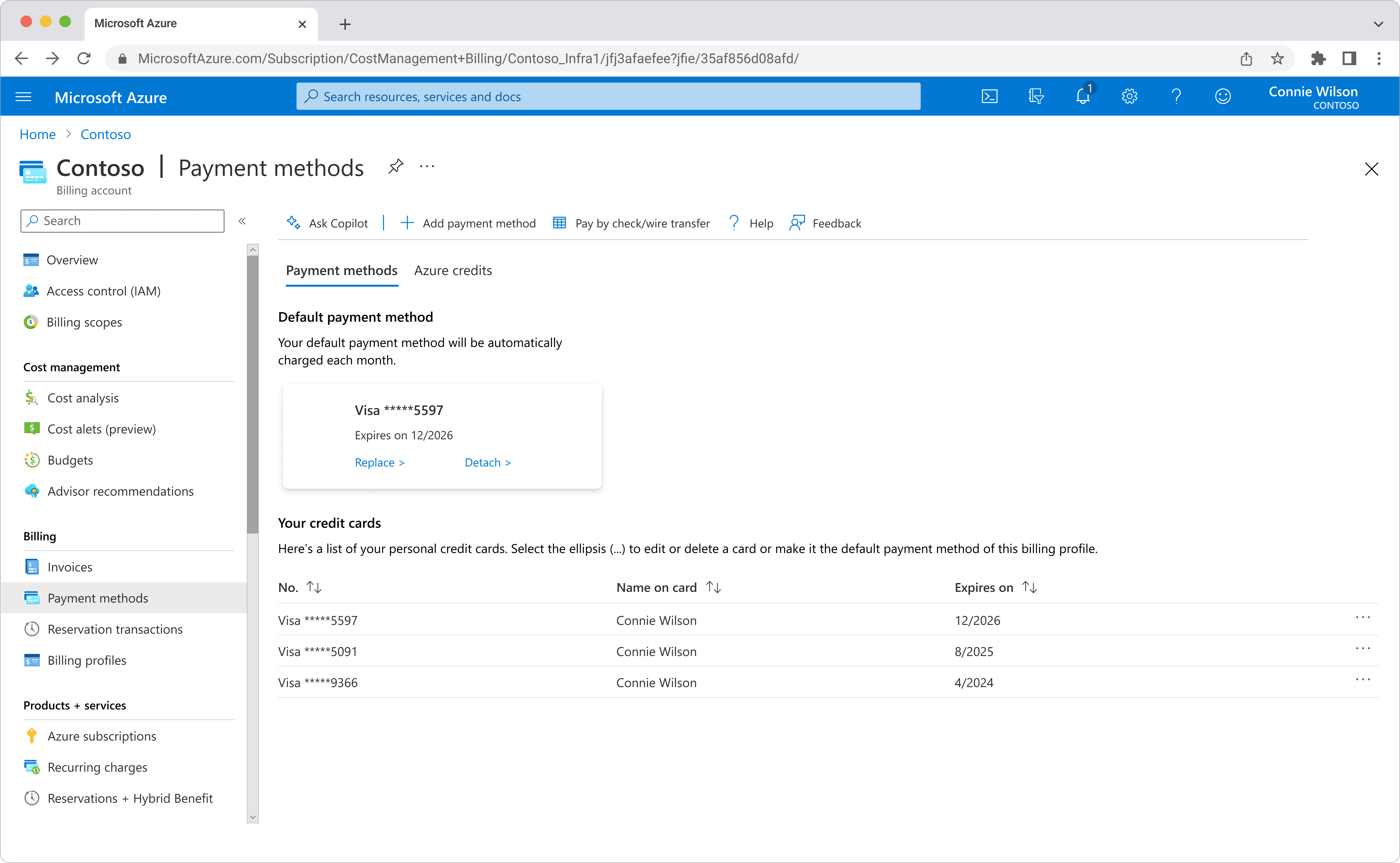
A persistent, toolbar entry point for pages with established command structures
A contextual card entry point for surfaces where the assistant could connect directly to relevant data
A guided entry point to introduce customers to this new feature, with predictable customer questions
All three patterns reused familiar Azure patterns, reduced engineering effort, and gave teams enough flexibility to place the assistant without creating a fragmented experience.
Challenge 2: Designing responses around customer intent
Customers came to the AI Assistant with very different goals. Some wanted to understand a sudden increase in spending. Others needed help interpreting an invoice or completing a task in Azure. A single response pattern could not serve all of those needs.
As the lead designer for Subscription Management and Invoicing, I helped define the common questions customers were likely to bring to the Assistant, based on the problems I had already seen across those experiences. These ranged from questions like “Why did my cost increase this month?” and “Compare this month’s invoice to last month’s” to task-based requests such as “How do I cancel my subscription?”
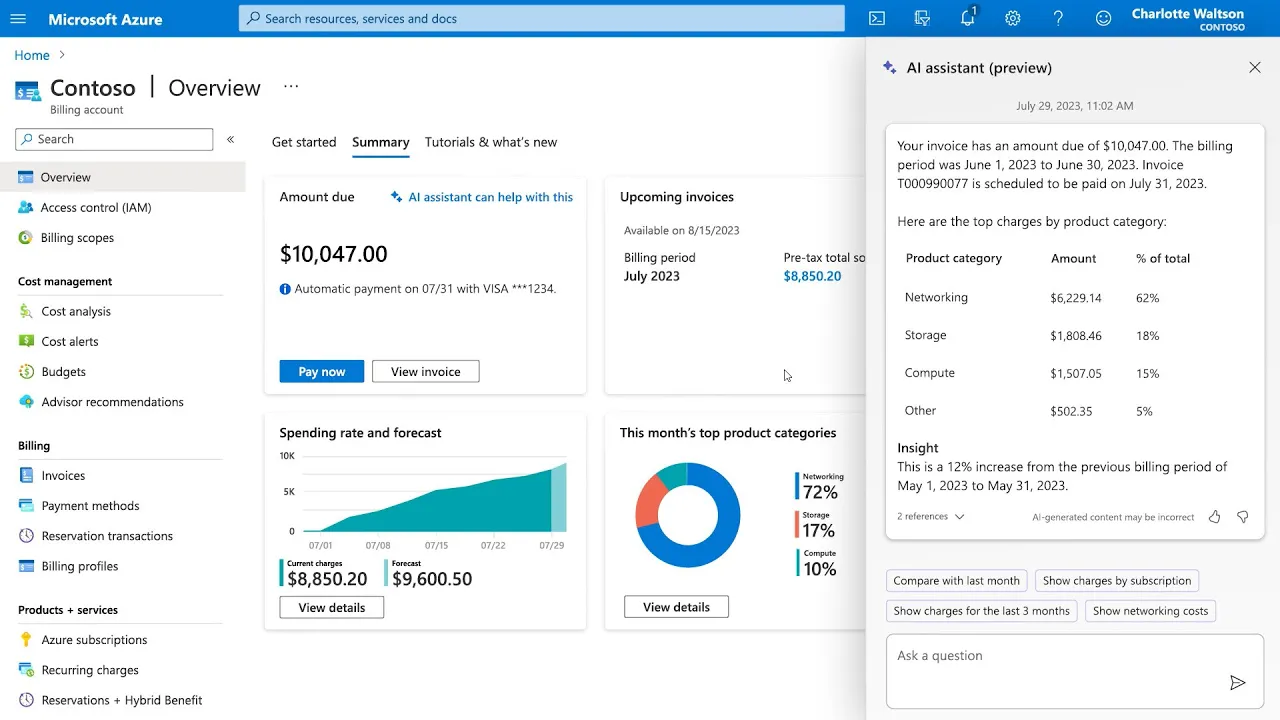
I designed the base response patterns for these interactions, determining what information belonged in an answer, when customer data needed visual support, how insights should be surfaced, and what questions could naturally move the conversation forward. I then partnered with Content and Engineering to refine tone, answer quality, available data, and what the Assistant could reliably support within the MVP.
Understand my data
Structured explanation, comparison grid, insight, and suggested next steps.

Explain what changed
Narrative explanation using the most relevant data points when a grid would not improve understanding.

Help me complete a task
Detailed step-by-step guidance with follow-up questions related to the customer's goal.

Matching the response to the question
Not every customer question needed the same type of answer.
For cost and invoice questions, the goal was often to help customers make sense of information rather than simply retrieve it. When a comparison or breakdown would be easier to understand visually, I paired the written response with a structured grid showing the most relevant data. The Assistant could then close the response with an insight that helped interpret what the customer was seeing.
Other data questions worked better as written explanations. If the important information did not translate clearly into a grid, I prioritized the most meaningful data points within the response rather than forcing them into a visual format that added little value.
Task-based questions required a different approach. Because the MVP could not reliably perform actions for customers or take them directly into another Azure experience, the response itself needed to be detailed enough to act on. For questions like canceling a subscription, I designed clear step-by-step guidance that could help a customer complete the task independently.
The response format followed the customer's intent, rather than forcing every conversation into the same template.
Answer
Establish the customer's situation and provide the most important information first.
Supporting data
Introduce structured information when it makes a comparison or pattern easier to understand.
Insight
Interpret the information instead of leaving the customer to make sense of the data alone.
Next conversation
Offer relevant follow-up prompts based on what the customer is likely to investigate next.
Designing conversations that could continue
A useful response was not necessarily the end of the interaction.
Across the design team, we established a general hierarchy for stronger responses:
Answer or explanation → supporting data or visual when appropriate → insight or recommendation → conversational follow-up prompts
I used follow-up prompts to anticipate what a customer would logically want to understand next.
If someone was confused about why their invoice was unusually high, for example, the Assistant could offer to compare the current invoice with the previous month. From there, the customer could select the suggested prompt or continue the conversation by asking another question.
The goal was for the Assistant to do more than return isolated answers. We wanted it to help customers work through a problem, understand what they were seeing, and continue exploring until they had enough information to make a decision or take action.
AI-Assisted Experience
Flip card
Exploration through conversation
Suggested prompts were designed as contextual next steps, not generic conversation starters.
“Why is my invoice higher?”
Assistant surfaces likely causes
“Compare with last month”
Early AI MVP limitations and constraints
The possibilities were much larger than what we could realistically ship within a three-month MVP.
I explored experiences where the Assistant could perform tasks, move customers directly into relevant areas of Azure, continue conversations across pages, and use richer interface elements such as charts, cards, and other data visualizations.
Many of those ideas were not yet technically feasible.
Visual responses were limited to simple grids. Access to certain customer data introduced technical and role-based permission concerns, particularly when information could not be retrieved reliably in real time. The Assistant could not perform tasks on a customer's behalf, and it could not move customers into another part of Azure and continue the same conversation there.
Those limitations directly shaped the designs.
If a richer visualization could not be supported, I had to determine which information mattered most and restructure it for a grid or written response. If the Assistant could not take a customer directly to a task, the instructions had to be clear enough to remain useful on their own. When data could not be accessed reliably, the response needed to avoid implying a level of precision or context the system could not support.
Many of my earlier concepts became simpler as we learned what the technology could reliably deliver.
That process changed how I thought about designing for AI. The challenge was not creating the most ambitious interaction possible. It was finding the strongest experience we could deliver responsibly within the capabilities of the system.
Explored
mvp
Explored
mvp
Explored
mvp
Explored
mvp
Explored
mvp
Learning without an established playbook
Conversational AI was still an emerging design space, and we did not have mature patterns or established best practices to rely on.
Validation therefore focused heavily on rapid internal testing with designers, researchers, PMs, engineers, and other partners. We evaluated whether the Assistant answered the intended question, whether data and visual elements appeared correctly, whether suggested prompts created sensible next steps, and whether the overall interaction behaved as expected.
A large part of the work required using product knowledge and design judgment to determine what felt understandable, useful, and trustworthy, then refining those decisions alongside the people responsible for making the experience technically possible.
The MVP ultimately shipped with the conversational response patterns I contributed across Subscription Management and Invoicing.
Challenge 3: Aligning teams under a compressed timeline
The assistant crossed several parts of Azure, requiring coordination between more than eight designers across three design teams, alongside research, content, product, and engineering.
Each team had its own surface constraints and priorities. At the same time, the product needed to feel like one coherent assistant.
I helped create alignment by:
Sharing entry-point explorations across teams
Evaluating patterns against common principles
Incorporating requirements from different Azure surfaces
Prioritizing reusable, engineering-feasible solutions
Adapting designs as the broader AI experience evolved
Keeping decisions moving within the three-month MVP schedule
Challenge 4: Championing accessibility for a new AI experience
Before the assistant could launch, the new component required an accessibility review.
I had not previously created this type of accessibility specification, but I took ownership of the work rather than treating it as a downstream review task.
I partnered with accessibility-focused designers and Microsoft’s Cloud + AI Accessibility team to define:
Focus and tab order
Heading structure
Screen-reader labels
Keyboard behavior
Accessible component states
I then worked directly with engineering to review implementation and ensure the specifications were reflected in the final experience.


Shipping the MVP
Despite the product ambiguity, number of participating teams, and compressed schedule, the team delivered the MVP in three months.
The early assistant experience was introduced publicly during Microsoft’s 2023 AI product rollout and made available to pilot and preview customers for continued learning and refinement.
From AI Assistant to Azure Copilot
The MVP was part of an early product direction that later expanded into Azure Copilot. Today, customers can use Copilot to investigate cost changes, summarize spending, compare usage, estimate future costs, and identify optimization opportunities through natural-language interaction.
My contribution focused on several foundational experience questions behind that direction: how customers discover AI assistance, how responses adapt to different customer intents, how conversations help customers continue exploring a problem, and how the experience remains consistent and accessible across complex enterprise workflows.

3 Months
Moved from an evolving AI concept to a pilot-ready enterprise experience within one quarter.

3 Design Teams
Created shared principles and reusable patterns across teams with different product surfaces and requirements.
2025 Growth
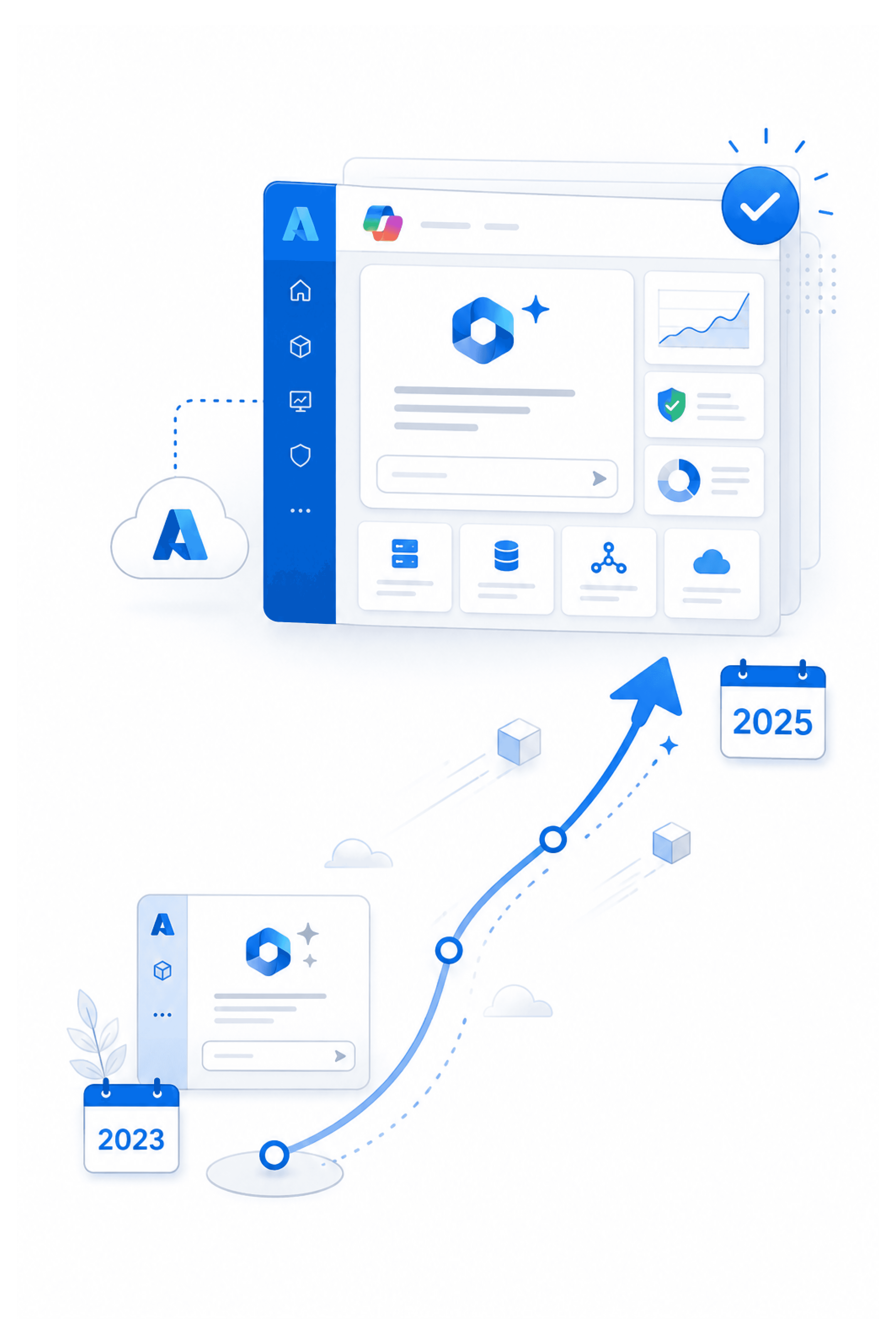
Microsoft Copilot in Azure progressed from its 2023 preview announcement to general availability in April 2025.

100s of Services
Azure Copilot now unifies knowledge and data across hundreds of Azure services and thousands of resource types.
This project changed how I think about designing AI experiences.
The hardest challenge was not drawing the assistant interface. It was introducing a new and rapidly evolving capability into a mature product ecosystem where customers depended on consistency, accurate financial context, and established workflows.
I learned to make progress through ambiguity, create alignment across team boundaries, and design flexible systems rather than one-off screens. I also expanded my accessibility practice by taking ownership of specifications for an unfamiliar interaction model and partnering with specialists to ensure the experience was ready to ship.
Designing the AI Assistant taught me that conversational UX is not just about writing a good response. It requires understanding the customer's intent, deciding how information should be structured, anticipating what they may need next, and knowing when technical limitations should change the experience rather than be hidden from the customer.
Most importantly, the work reinforced that AI creates the most value when it is grounded in customer context and integrated into the tools people already trust.
The most effective AI experience is not simply visible. It appears at the right moment, understands the customer’s context, and helps them move forward with confidence.