














Zero to One
User Testing
Design Systems
Taking a Mobile Trivia Game From 0 to 1
As the sole UX/UI designer for Trivia Connect! – Hollywood, I transformed an experimental trivia-game concept into a complete mobile experience, from research and interaction design to prototyping, testing, and launch.
When beta feedback exposed major usability and visual-design problems, I expanded my role, rebuilt key parts of the experience, and created a new UI system to help the team ship across iOS and Android.
Role
· Product Designer
· UX/UI Designer
· UI Artist
Team
Product Owner, Game Designer, Art Director, Front-end and Back-end Engineering, Marketing, and Leadership
Outcome
· 1,000+ downloads
· 4-star average rating
· 26% average Day 1 retention
Designing a new way to play trivia
Trivia Connect! was built around a new single-player mechanic called Cross-Actors, combining elements of crossword puzzles with movie trivia.
Instead of answering traditional multiple-choice questions, players used clues to place actors into a grid and form movies they had appeared in together.
The concept was unique, but that also created the first design challenge: players had no existing mental model for how the game worked.
As the sole UX/UI designer, I needed to turn an abstract game mechanic into an experience that could be learned quickly, played comfortably on a phone, and expanded into a larger progression system.
From game mechanic to complete experience
Cross-Actors was only one part of the product. Players also needed to learn the rules, navigate levels, understand rewards and power-ups, recover from mistakes, and progress through the larger Hollywood experience.
I began by studying leading mobile trivia games and player reviews to understand the conventions customers already expected. One pattern stood out: successful games avoided front-loading instructions. They introduced mechanics gradually through play, supported by bold visual feedback and lightweight guidance.
From there, I mapped the game's core flows and translated them into increasingly detailed wireframes. Those screens eventually became a clickable prototype of more than 500 screens, allowing the team to experience the first-time user journey before committing to development.
Testing the first playable experience
Internal testing helped us refine the first-time experience before development, but the larger test came once a playable beta reached real players.
For 2–3 weeks, we distributed the beta to friends and family, reaching more than 100 players. I collected and organized their feedback, then worked with the team to separate isolated reactions from patterns that could affect the MVP.
The testing exposed four recurring problems:
Beta Testing Summary
Beta players
Friends , family, and trivia fans
across different ages and devices.
2-3
weeks
Active testing period with continuous
feedback and iteration.
our goal
The testing exposed four recurring problems:
Too much to read
Players skimmed or skipped the tutorial, then entered gameplay without fully understanding how Cross-Actors worked.

Comprehension
Tutorial overload

Accessibility
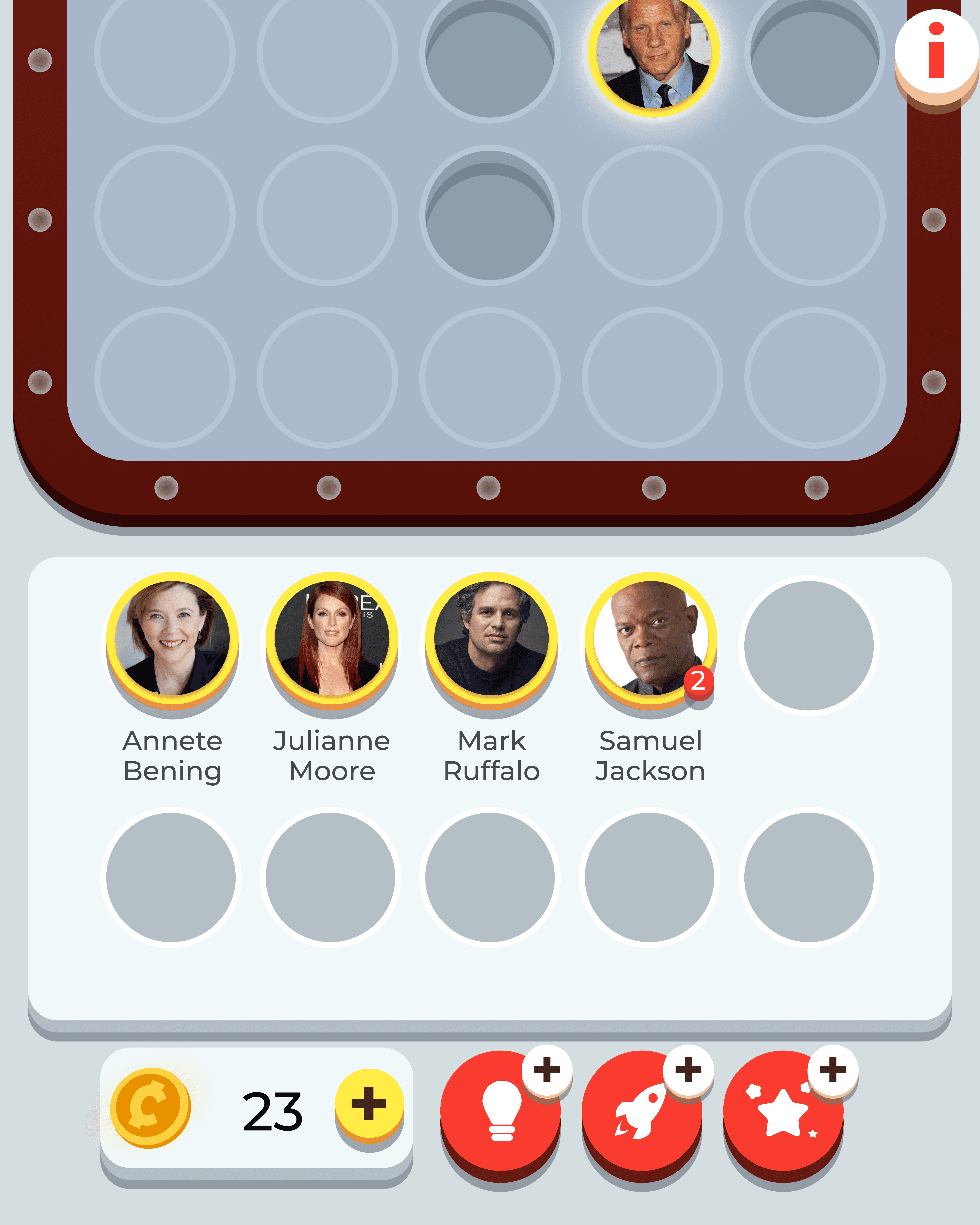
Small actor portraits
Difficult to see
Actor portraits were too small for some players, particularly on smaller devices and for customers with impaired vision.
Difficult to understand
Several icons looked too similar, did not clearly communicate that they were interactive, or felt disconnected from the game's cinema theme.
Clarity
Ambiguous iconography

Visual quality
Unfinished art direction
Not ready visually
Players described the existing visual style as unfinished and less engaging than the games they were accustomed to playing.
The beta changed our priorities. Rather than simply adding polish before launch, we needed to simplify how the game taught, communicated, and presented itself.
Designing around player's actions
The biggest usability problem was the tutorial.
Our original experience relied too heavily on written instructions. Players frequently skimmed or skipped them, which meant the information technically existed but was not helping customers learn.
Instead of adding more explanation, I changed the teaching model.
I replaced text-heavy instructions with visual demonstrations that showed players what to do as they encountered each mechanic. Subtle animation and feedback reinforced the expected interaction, while short Tip Screens introduced additional concepts gradually throughout the first 10–15 levels.
This shifted onboarding from:
Read everything → remember it → play
to:
Play → learn in context → reinforce over time
The goal was not simply to shorten the tutorial. It was to make learning part of the game itself.

Making important information easier to see
Increasing the actor portraits outright would have reduced the space available for the puzzle and other critical game information.
Instead, I borrowed an interaction already familiar to mobile users: tap and hold to preview.
Pressing an actor portrait enlarged the image in the center of the screen and surfaced the actor's name. Releasing returned players immediately to the puzzle.
The interaction gave customers a closer look when they needed it without permanently sacrificing screen space or changing the underlying game board.
Making actions feel like part of the game
Testing also showed that players struggled to distinguish some icons and understand what would happen after selecting them.
I partnered with the Art Director to redesign the power-ups and supporting controls around two goals: make actions easier to recognize and make the interface feel unmistakably cinematic.
Generic symbols were replaced with clearer, differentiated iconography inspired by the game's movie theme. The change improved functional clarity while beginning to establish the stronger visual language the product needed for launch.
Before


After


Adapting when the startup changed
During beta testing, our UI Artist left the company.
With the MVP approaching and no opportunity to hire a replacement, the visual quality problem uncovered during research became more than a design recommendation. It became a delivery risk.
I stepped beyond my original UX/UI responsibilities and took ownership of the game's visual redesign alongside the Art Director.
That meant moving between product design and production art: defining a new visual direction, redesigning components and screens, building reusable assets, and making sure engineering had what they needed to implement the system consistently.
In a small startup, there was no clean handoff between “UX” and “UI.” The work that needed to ship became the work I needed to solve.
My original scope
UX/UI Design
Resesarch
Interaction Design
Prototyping
Startup constraint
UI Artist leaves during beta
Expanded ownership
Visual Direction
UI Art
Design System
Production Assets
Rebuilding the visual experience
The beta interface worked, but it did not yet communicate the personality of a Hollywood trivia game.
Working closely with the Art Director, I developed a new visual direction centered around cinema and entertainment. The redesign affected the larger experience, from the level map and game screens to buttons, typography, power-ups, and supporting UI.
Rather than treating those updates as individual screens, I built them into a reusable Figma design system.
Shared components, colors, typography, and production-ready assets gave the experience a consistent visual language while making it easier for our front-end developer to implement and extend the product as we approached launch.
Before
Beta UI

Color palette
#F5FDFF
Mist - 01
#CAD6D9
Mist - 02
#4F636B
Slate - 01
#313E42
Slate - 02
Typography
Aa
Buttons
Power-ups
Toggles
Player Status
Game-board & puzzle elements


Shipping the MVP
Trivia Connect! – Hollywood launched on both the Apple App Store and Google Play Store.
Within its first month, the MVP reached:
0%
Average Day 1 player retention rate
0%
Peak Day 1 player retention rate
Player 1
I've already played through all 50 levels. When will there be more?
Player 2
It looks so much better. I like how the game fits the cinema and Hollywood theme.
Player 3
I like it. It's fun and challenging.
The product did not reach every business target, and the startup was ultimately unable to secure additional funding. But the MVP validated something important: an unconventional game mechanic could be transformed into a product that players understood, downloaded, completed, and asked to play more of.
Reflection
Trivia Connect taught me that designing a product from zero to one is rarely a straight path from idea to execution.
I began the project translating an unfamiliar game concept into flows and prototypes. Research then challenged assumptions we had made about how players would learn and interact with it. When the startup lost a key teammate before launch, the work changed again, and I expanded my role to help close the gap.
The experience shaped how I approach product design today:
Build enough to learn
A 500+ screen low-fidelity prototype gave the team something tangible to challenge before investing further in development.
Watch behavior, not just intent
The tutorial contained the information players needed, but testing showed that having information available is not the same as communicating it effectively.
Constraints changed quickly. Good solutions needed to account for product quality, engineering feasibility, available resources, and the reality of a small startup.
When the project needed visual design and production support, expanding my role helped the team move from a functional beta to a cohesive product ready for launch.
From the first wireframe to the final App Store build, the project taught me how to keep designing when the product, team, and constraints are all changing at once.